- Packages I will use to read in and plot the data.
- Read the data in from part 1.
Interactive Graph
Start with the data
Group_by entity so it shows it worldwide.
Use e_charts to creat an e_charts object with deaths by Air pollution
THEN use e_timeline_opts to set autoPlay to TRUE
THEN use e_bar to represent the variable year
THEN use e_title to set the main title to ‘Deaths by Air Pollution in Afghanistan’
THEN remove the legend with e_legend
number_of_deaths_by_risk_factor %>%
  group_by(Entity) %>%
  e_charts(x = `Deaths - Cause: All causes - Risk: Air pollution - Sex: Both - Age: All Ages (Number)`, timeline = TRUE) %>%
  e_timeline_opts(autoplay = TRUE) %>%
  e_bar(serie = Year) %>%
  e_title(text = 'Deaths by Air Pollution in Afghanistan') %>%
  e_legend(show = FALSE)
Static Graph
Start with the data
Use ggplot to create a new ggplot object.
- Use aes to indicate the year on the x axis and deaths by air pollution to the y axis.
Use geom_line to show deaths
scale_fill_discrete_divergingx will set the palette to “roma” and selects 228 colors for each type.
theme_classic sets the theme
theme(legend.position = “bottom”) will put the legend at the bottom of the plot.
labs sets the y axis label, fill = NULL shows that the variable will not have the labaelled Entity.
number_of_deaths_by_risk_factor %>%
  ggplot(aes(x = Year, y = `Deaths - Cause: All causes - Risk: Air pollution - Sex: Both - Age: All Ages (Number)`,
             fill = Entity)) +
  geom_line() +
  colorspace::scale_fill_discrete_divergingx(palette = "roma", nmax =228) +
  theme_classic() +
  theme(legend.position = "bottom") +
  labs(y = "deaths in billions",
       fill = NULL)
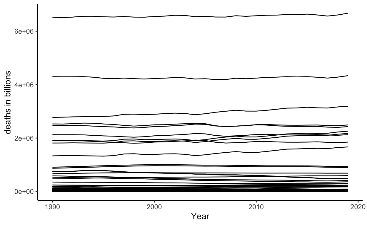
This shows how many deaths there were from 1990 to 2019.